Effective data visualizations can help localities make sense of housing data, revealing trends or patterns that may not otherwise be evident in the underlying data. They can also help communicate information to community members, elected officials, and other housing stakeholders. Finally, compelling visualizations can help generate support for housing initiatives and promote positive change in communities. This brief describes key considerations and best practices for developing and leveraging data visualization and includes multiple examples of housing-related visualizations.
Using local housing data in data visualizations
Localities increasingly use data visualizations to help analyze housing issues, track progress in implementing programs, address housing challenges, and share information about housing with a variety of stakeholders. Some common types of data visualizations and the benefits of using them are included below.
- Data dashboards compile and present a variety of data and typically focus on a single topic, like housing. Localities often use dashboards to enable users to track their performance, such as achieving affordable housing development goals.
- Maps are an effective way to visualize geospatial data. They can be static or interactive and are often embedded in other data visualization tools like a data dashboard or a story map. Maps can help users identify patterns and trends that may not be apparent in the raw data.
- Story maps are a way to blend data with narrative and multimedia elements. Users can explore story maps at their own pace and view videos, reports, records, and maps integrated into a single cohesive product. Story maps can be used to tell a complex story in a compelling, engaging way.
- Charts, tables, and infographics can be just as effective as more dynamic tools at presenting data and typically require fewer resources or technical skills to produce. Localities can add these to static products, such as reports and presentation slides, with relative ease.
Potential data sources for visualizations
Localities may have multiple sources of local data they can use to create data visualizations. The following table shows typical sources of housing data many localities have access to and suggests potential data visualizations they could develop using the data.
Table 1. Potential Data Sources for Visualizations
Assessing the quality of potential data sources
While localities may have many potential sources of data to create visualizations, some sources may be easier or harder to visualize. Localities may need to assess the quality and suitability of the data and prepare it for data visualization, especially for more sophisticated visualizations like interactive mapping or tracking tools. It’s worth noting that even when data are incomplete, creating a visual or dashboard can motivate better data entry and tracking and serve as a mechanism for improving data quality in the long run. Consider the following questions to help determine the level of effort needed to prepare data for visualization:
- Are the data accurate, or do they have errors that must be corrected before being used?
- Are the data complete, or do they have large gaps that must be filled to be useful?
- Are the data current and, if applicable, updated regularly, such as for a data tracker you intend to maintain over time?
- If applicable, are the data available at the neighborhood or other geographic level you intend to show in the visualization?
- Can the data be disaggregated by race, ethnicity, or other categories of interest?
- Are the data cleaned and formatted as needed for the data visualization software you intend to use?
- Will the data need to be digitized, such as data from historical records or PDFs?
- Will you need to assemble a shared database using data across multiple agencies or external partners?
Design considerations
- Highlight important trends, patterns, connections, or other findings you want end users to learn about;
- Reach a new or wider audience of people who may not have the time or ability to explore the underlying data on their own;
- Help staff communicate with residents about an important topic or project;
- Enable users to explore data via an interactive tool; or,
- Efficiently synthesize large datasets or data from across multiple agencies or partners.
- Design for your audience and purpose. Different audiences may have different levels of knowledge of the underlying data or topic covered in the visualization. They may also have different levels of comfort with digital tools. A dashboard that tracks progress toward affordable housing goals, for example, may only focus on high-level outputs if it is designed for the public. In contrast, one designed for elected officials or municipal staff might include more detail on metrics and milestones. Also, consider your purpose when choosing a visualization type. A tool designed to enable staff to use visualizations to analyze housing data to track program performance or inform policy decisions may require specialized software and interactive features, while a visualization designed primarily for informing the public about a housing topic may not.
- Choose a data visualization type that fits the data. Review the data for the best type of visualization to create. A dataset that includes property addresses, for example, may be useful for creating maps that show differences across neighborhoods. Categorical data are best paired with bar charts, while changes over time, trends, and forecasting may be paired with line graphs. Many types of data can be visualized in several ways, so consider mocking up different examples to help determine the best types of visualizations to create.
- Incorporate equity. Localities can also center equity in their data visualizations by 1) considering ways in which data may be biased or incomplete and 2) presenting the data in ways that highlight rather than conceal inequities and educating their audience about the unique attributes, perspectives, or needs of BIPOC populations. When possible, use data disaggregated by race, ethnicity, or other important demographic characteristics for your visualizations.
- Provide accessibility. It’s important to ensure that people with disabilities can access and understand your visualizations. You can take steps such as adding alternative text to visualizations and manipulating colors and contrast levels to make them more accessible. Many helpful guides and tips on incorporating accessibility features are available online, including resources from the federal government, Urban Institute, Cornell University, and Harvard University.
- Seek feedback. Consider gathering feedback on visualizations you develop, particularly more complex ones, from members of your target audience to ensure they are accessible and comprehensible to a wide audience.
Data visualization examples
Data visualizations can be used by localities to educate and inform residents and other stakeholders on a variety of housing topics or can be tools for municipal staff whose work touches on housing. Below, we highlight several examples of localities’ effective use of data visualizations.
Advancing racial equity in Louisville, Kentucky
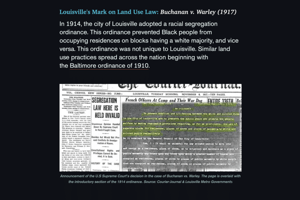
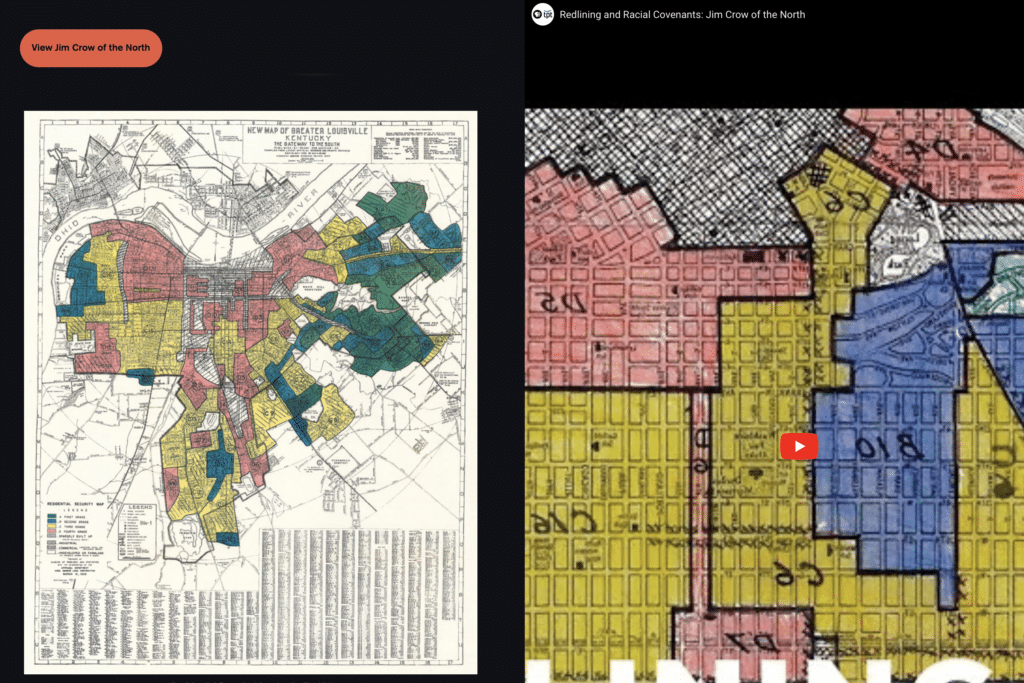
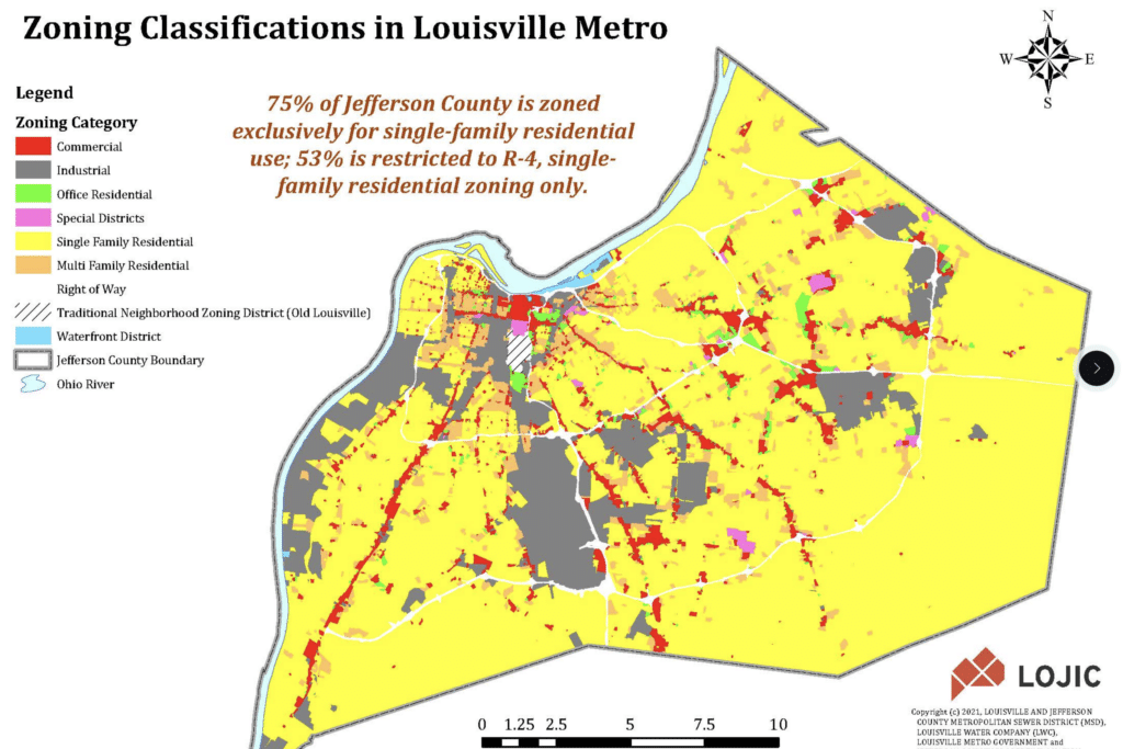
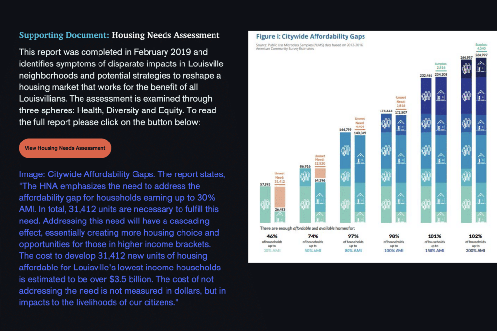
Louisville’s story map, Confronting Racism in City Planning and Zoning, offers users a comprehensive overview of historical factors that shaped housing and land use inequities in the city and how that history still shapes the city today. The story map was created as part of a broader effort to use an equity lens to update Louisville’s land use ordinances to align with its comprehensive plan (Plan 2040). Louisville’s story map is notable for its heavy use of archival materials, like old zoning maps and newspaper clippings, that lay bare the racist motivations that underpinned city land use and housing policy choices. A user of the story map can explore how and why segregated neighborhoods were created and maintained and the role of zoning in supporting segregation and limiting housing choices and economic opportunity for BIPOC residents, among other topics. Users can also learn about and access resources on Louisville’s recent land use reforms, such as its Advancing Equity report or Housing Needs Assessment, and find other ways to be engaged in the process.
Examining linkages between health and housing in King County, Washington
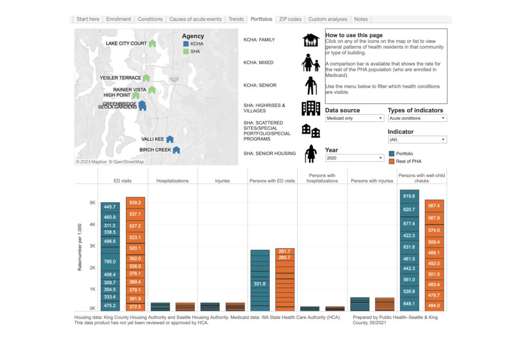
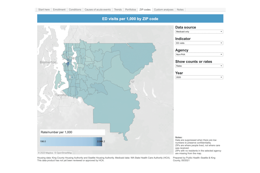
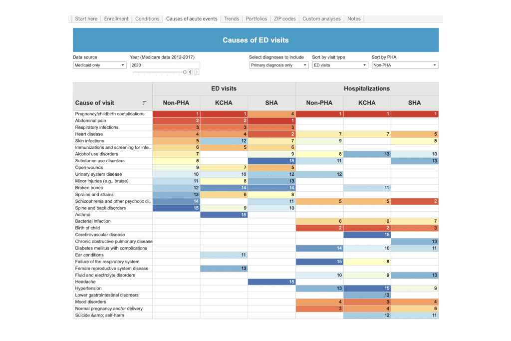
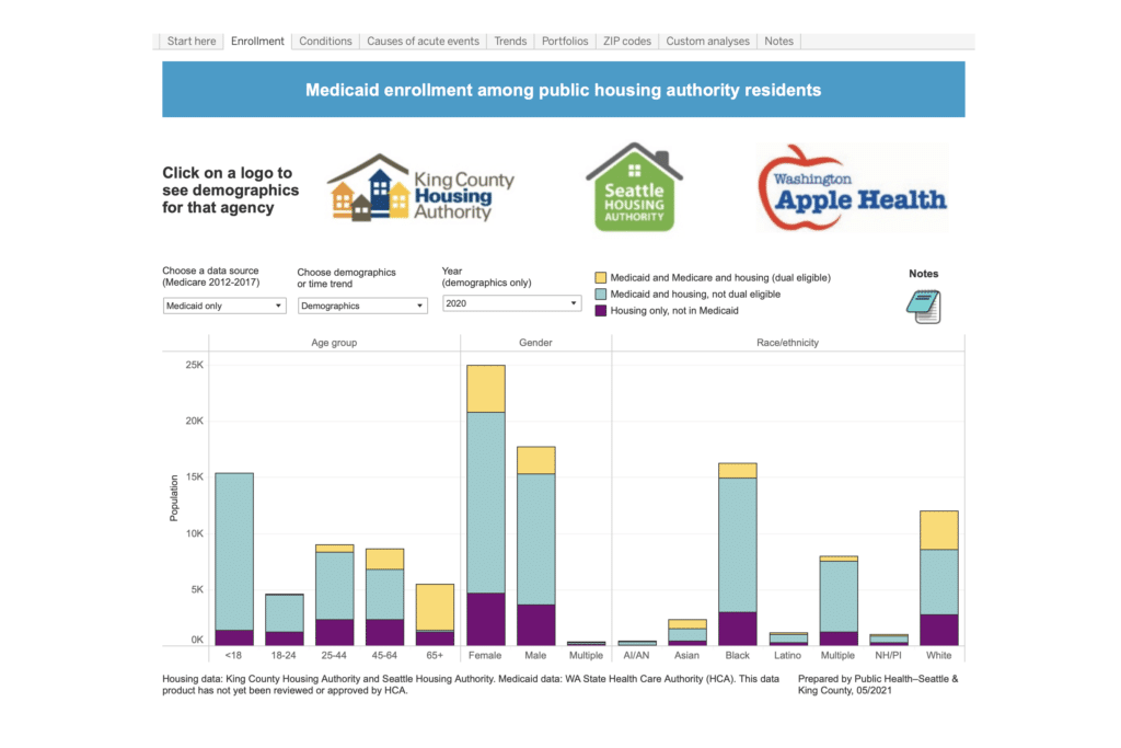
King County’s Health and housing data dashboard examines health outcomes for residents of public housing authorities. The dashboard displays demographic information, health conditions, causes of acute events, trends, and other information using both Medicaid and King County Housing Authority data. Users can apply filters to isolate and drill down on specific topics of interest and compare indicators over time, across public housing agency (PHA) sites and neighborhoods, and by subpopulations, among other options. This tool may be especially valuable to policymakers and practitioners interested in identifying and addressing health disparities, such as by tailoring public health resources to the needs of specific PHA properties.
Tracking vacant property in St. Louis, Missouri
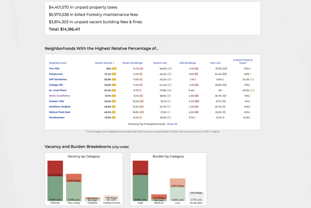
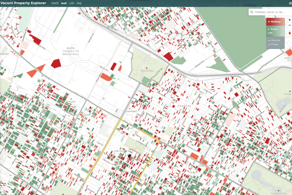
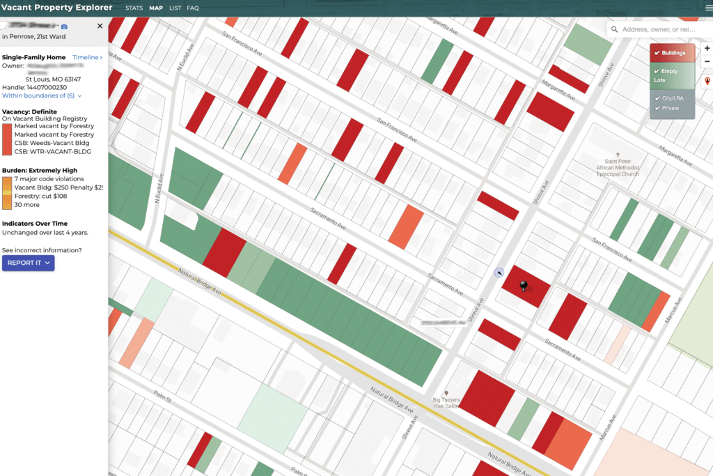
St. Louis has a Vacant Property Explorer, an online dashboard designed for in-depth exploration of vacant property data within the city. This dashboard is updated monthly with data from four sources: the Building Division, the Forestry Division, the Citizens’ Service Bureau, and the Land Reutilization Authority. Properties are scored on their likelihood of being vacant. They are displayed by list, map, and subcategories such as resident type, property ownership, neighborhood, and cost to the city for maintenance or enforcement.
The online dashboard is notable for including both summary-level vacancy statistics and granular parcel-level data in a user-friendly platform. Users can search for vacant properties by address, owner, or neighborhood and download vacancy data for the entire city or individual neighborhoods. The dashboard is also designed to identify vacant lots as well as residential and commercial buildings. With this tool, users can select individual parcels to learn more about the property’s code violations and costs to the city, such as expenses incurred for mowing overgrown lots.
This tool may be helpful to planners seeking to understand areas of the city where vacancy is decreasing over time, which may inform decisions about where the city might allocate resources to spur increased private investment. Alternately, the tool can help reveal where vacancy is increasing, which may influence strategies to stabilize housing quality and address blight. Community groups might use the tool to advocate for public investment in new affordable housing on city-owned vacant lots.
Measuring progress in implementing Fort Collins, CO's housing strategy
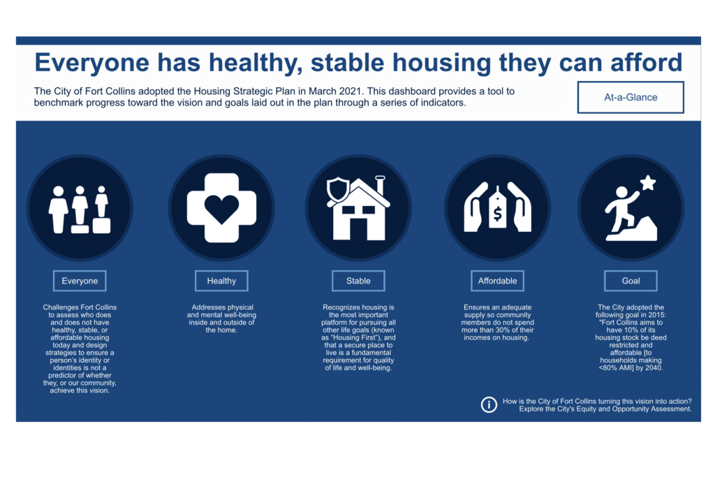
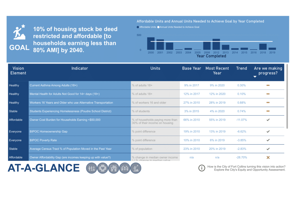
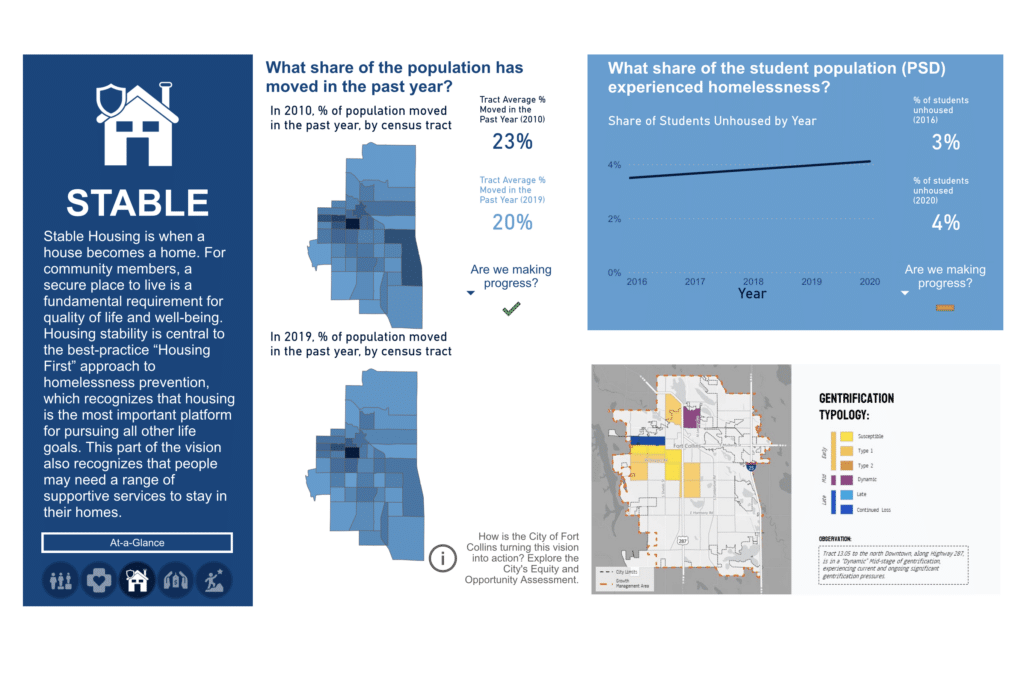
Fort Collins’ 2021 Housing Strategic Plan aims to ensure that “everyone has healthy, stable housing they can afford.” To that end, the city developed a dashboard to track progress toward goals included in the strategy. The dashboard is separated into sections that show progress toward similar goals, such as those related to housing stability, plus a section that shows progress for all of the city’s goals in one place. Users navigate a mixture of static and interactive maps, tables, and graphics to easily understand the progress the city is making. Users can also access links for more information about indicators included in the dashboard and steps the city is taking to achieve its goals. The dashboard is designed in such a way that the city can update it with new data as becomes available, an important aspect of monitoring the progress of housing strategies.
Monitoring homelessness services in Santa Ana, California
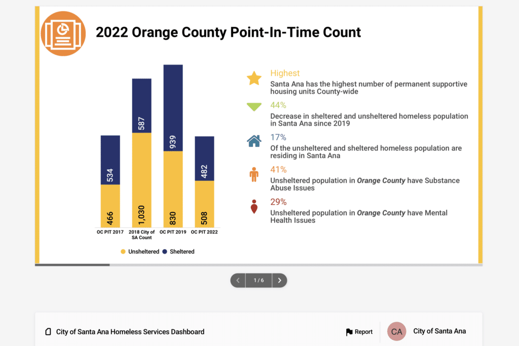
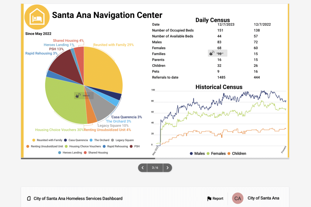
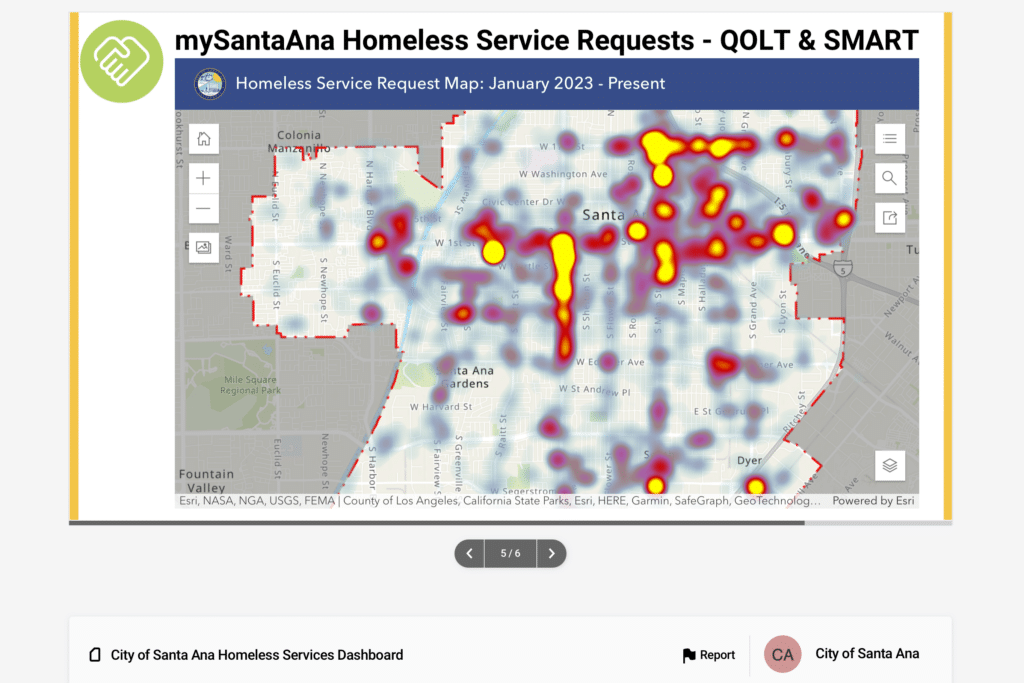
Santa Ana maintains a Homeless Services Data Dashboard based on their Point in Time Count and Homeless Management Information System data. The dashboard offers insights into the ecosystem of homelessness services in the city and statistics on homelessness counts and permanent supportive housing and emergency shelter housing units, among other data. This dashboard stands out for its use of basic but attractive and accessible data visualizations to tell a story about a critical housing issue. Santa Ana also has several well-designed infographics on homelessness, such as its Homeless Resource Kit and Homeless Fact Sheet.
Sharing up-to-date housing and land use statistics in Bellingham, Washington
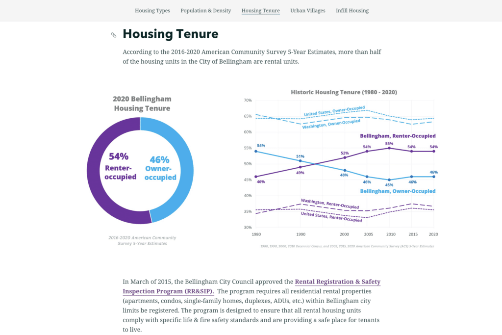
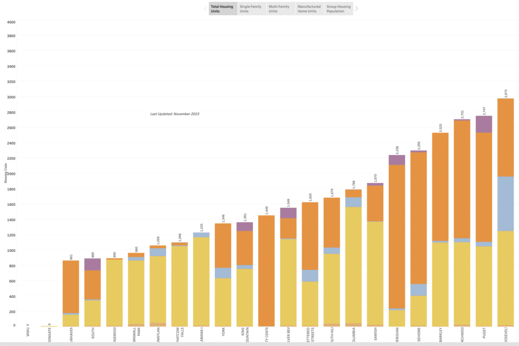
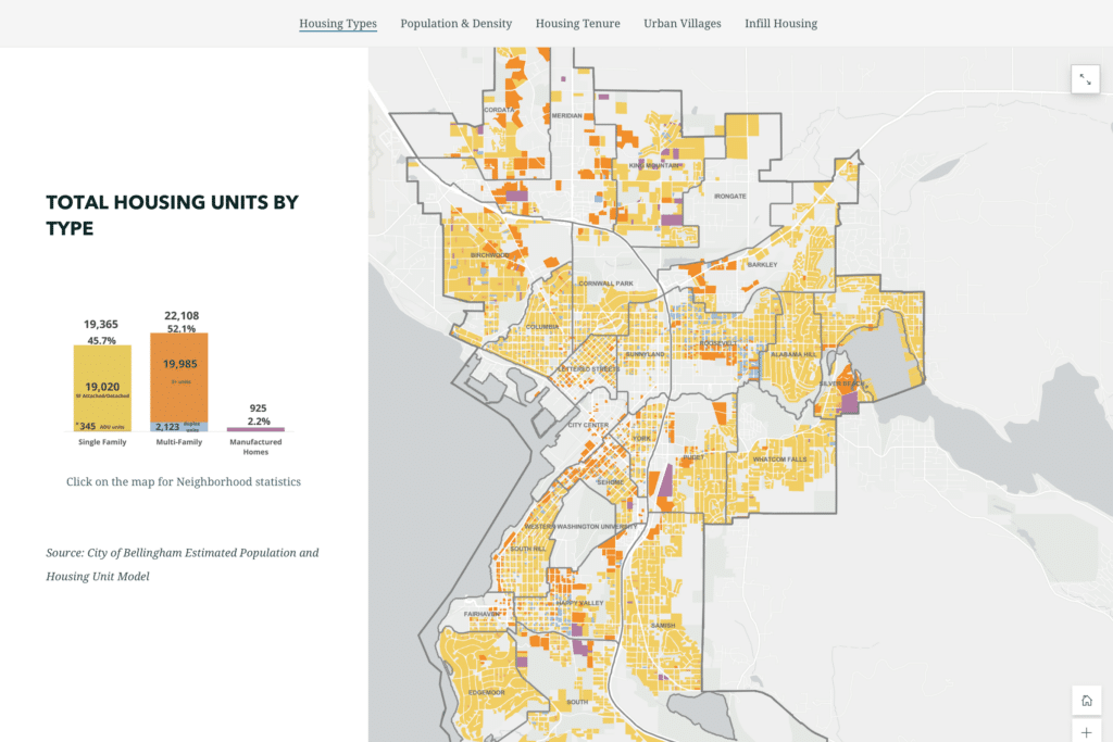
Bellingham’s housing statistics story map blends multiple data sources in five topic areas: Housing Types, Population & Density, Housing Tenure, Urban Villages, and Infill Housing. As viewers scroll through the story map, the site provides a narrative overview of the data displayed but also gives viewers space to explore the data directly using various interactive features. For instance, users can select a neighborhood in one interactive map to access specific population and housing characteristics data. Users can also learn how different infill development types – such as cottages and fourplexes – are regulated and see illustrations of the infill housing types allowed in Bellingham.
Educating the public about climate change impacts in Shoreline, Washington
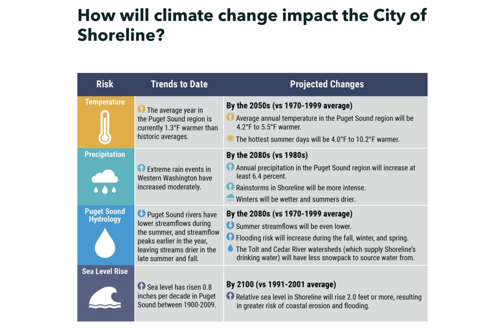
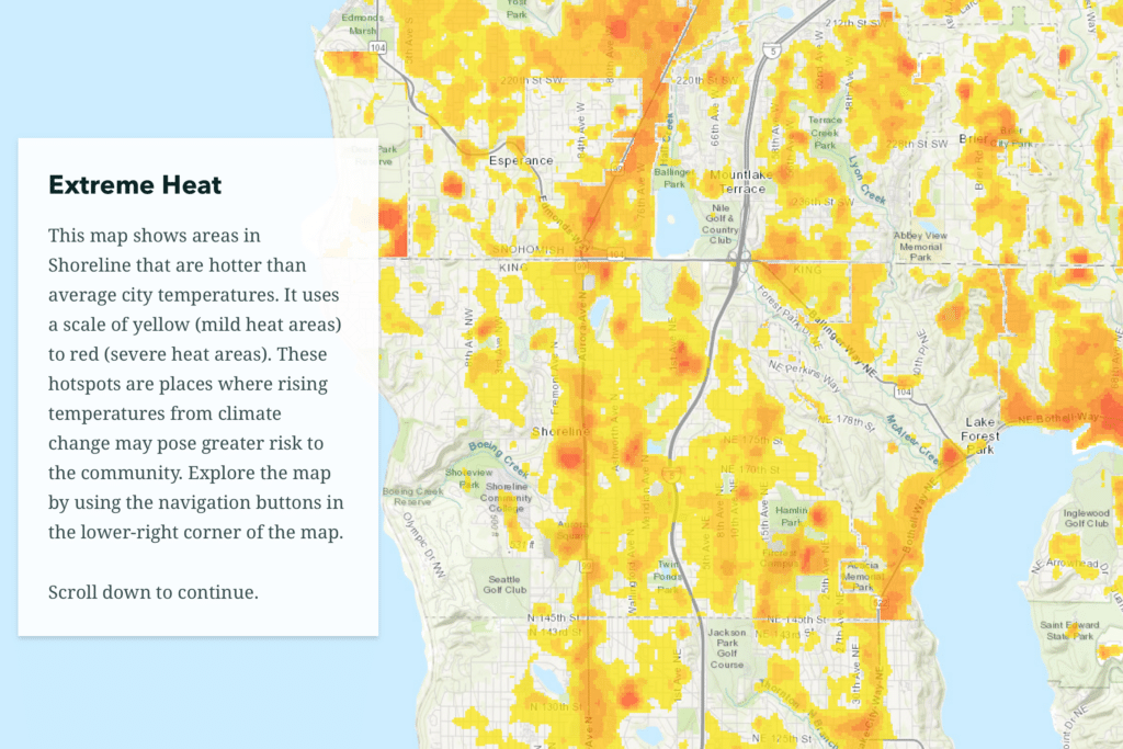
Shoreline developed a story map to help readers understand how climate change may impact the city and how it is responding to the risk. The story map provides a high-level overview of climate-related risks and links to several more detailed and visually appealing briefs on relevant topics, such as public health risks associated with climate change. The story map also includes infographics and a choropleth map that shows the extent to which parts of Shoreline are vulnerable to extreme heat. Shoreline’s story map is notable for distilling information on a complex topic into a set of bite-sized and easy-to-understand communications.
Additional resources
Visualizing nationally available housing and demographic data
Housing Needs Assessment Tool (HNAT). This tool by the Housing Solutions Lab uses national datasets to generate a customized set of charts and maps describing key housing indicators by race, ethnicity, age, and income for every city, county, and metropolitan statistical area in the country.
Data visualization guides and resources
Data Dashboard. A presentation by the California State Association of Counties offers useful tips on designing data dashboards. The organization also offers additional resources on the topic.
Data Visualization Guide. A resource from Johns Hopkins University’s Center for Government Excellence with guidance on selecting and creating the right type of visualizations based on available data.
Map Accessibility. The State of Minnesota offers a variety of resources for designing accessible static and interactive maps.
Solutions Search. A searchable repository of local, state, and federal government maps and other data visualizations maintained by Harvard University’s Data-Smart City Solutions project.
Story Map Templates. This University of Illinois guide provides tips on designing story maps.
Urban Institute Data Visualization Style Guide. While developed as a guide for its own website, this guide contains helpful tips and best practices that generally apply to basic data visualization types.
Using Data Visualizations to Understand the Scope of Evictions and the Impact of ERA Programs. A resource from the National League of Cities focused on eviction prevention programs that discusses best practices for data visualizations.
Resources on finding and using local data
Catalog of Administrative Data Sources for Neighborhood Indicators. Created by the Urban Institute, this catalog details local administrative data from public and private sources that could assist analysis in the areas of housing, social services, health, and the environment, among others.
Neighborhoods by Numbers: An Introduction to Finding and Using Small Area Data. This guide by Allan Mallach provides information on finding and using neighborhood-level data, including national and local data.
Unlocking the power of local housing data. This Local Housing Solutions resource discusses common types of data available to localities and how they might use local data.
Publication date: February 15, 2024